
Small Update: Just saw that Joshua Porter wrote a nice post in which he states that design (not just UI) is becoming increasingly important. Ties in nicely with this post 😉
One of the most difficult things to get right as a designer is the User Interface of a product or service. Getting the UI right is a key success factor in any development. To me the UI isn’t just the look, feel or the interaction. To me the UI defines the identity of the product or service. It is the only thing a user ever sees (unless he peeks under the hood, but then it’s not your average user anymore, it’s a geek 😉 ). When confronted with a UI I find myself (un-)consciously making all kinds of assumptions about the product, it’s capabilities, it’s difficulty or ease, but most of all it’s identity. The UI defines the product or service so to say. I’ll show you a few examples later on.
There are many factors that make the development of a great UI incredibly difficult. You have to think about the function of the product (what is it for), how it is used, where it is used, physical dimensions, material, color, all possible human senses, the form factor, consistency, complexity, in and outputs. This list goes on and on.
When I was working on my PhD in the field of Industrial Design, I met quite a few designers, both professional and those that were educated to become a designer. It seemed to me that the best UI designers had the ability to consequently apply certain design rules they formulated for themselves before they started a design. These design rules were typically inspired by that long list of requirements I mentioned above. They would spent a lot of time formulating such requirements, because they knew that it would help them design more effectively once these requirements and design rules were formulated.
One of the most difficult aspects of UI design is that the designer needs to play hardball with the other developers once development started. Not only does everyone have his own expert opinion on what a UI should look and feel like. it also turns out that in the process of creation there is less time and less budget available to do things right. As a result, shortcuts are taken and the overall design suffers. This is also the phase where the feature war takes place. I have yet to see a project that implements just the features that were specified initially. More often, developers start freewheeling using their own or alpha user’s feedback and add features to the original design.
Why am I discussing all of this on a weblog about media and technology? Because, in my opinion, a UI can make or break any new product or service. Web 2.0 has brought us the (re-)invention of the Beta release. Every startup that creates a new service starts with a Beta release (sometimes Alpha). This has several advantages of which time to market is most important. Instead of having a development cycle of years, the pressure in the market we now call web 2.0 has reduced that cycle to months, sometimes weeks. It’s more important to be out there, testing the functionality with Beta users, than to spend a lot of time on specification, design and implementation only to find out you are either too late, or you created a great product no one was really waiting for. There is a huge trade off here. Developing with your potential user group shortens the development cycle, but at the cost of stability and usability. But that isn’t the only thing. The Beta period is often also used to test the initial value proposition of the new service. Features are added during the test period and the final release v1 often provides a different service than the Beta release did.
In my opinion the usability and User Interface are often not well thought through. And that is too bad, because it inhibits the user to understand and use the essence of the product or service. This factor can literally break a service from becoming mainstream (along with many other things). UI design is very personal, it’s hard to say in general a design is good or bad.
Let me provide you with a few UI designs I like/dislike. That doesn’t imply that they are good/bad, it’s just my personal opinion. There isn’t any ranking involved, I just selected a few examples, I could have chosen any other really.
The iPhone
An interesting example. The iPhone UI is definitely revolutionary. It is one of the best UI’s I have seen in any handheld computer. The touch screen and the simplicity and consistency of the design are incredible. But to give you an idea how incredibly complex UI design really is, I believe the UI of the iPhone also makes it one of the worst mobile phones I have ever used. Actually, I should have probably said MOBILE device. Steven Hodson asked if I had a kevlar vest when I posted that, and many of the readers disagreed with me. But hte people that disagree are likely looking at it from a handheld device, not from the concept of a mobile phone. The reason for my bold statement is that that very same interface everyone loves doesn’t function well when you are mobile!

Try making a phone call while you are walking around, literally. The touch screen provides no tactile feedback, the buttons displayed are way too small for selecting contacts, letters or numbers, and the amount of actions needed to select a contact and actually make the call are too much. In my opinion, the design is optimized for an immobile user (meaning standing still). The touch screen forces the user to use his eyes as the main sense. The UI sucks you and your attention into the device, and shuts off a number of other senses. All that is left is a tunnel vision. Try it, you’ll know what I mean. Walk, start trying to type an SMS, listen to your surrounding, try not to hit anything etc. It’s Impossible. A regular phone allows tactile input and feedback. I can type blind on a GSM that has buttons because I can find the buttons without looking. I can walk and still perform basic tasks. in other words, I can use the mobile phone while i’m mobile. That’s impossible on a touch screen. The same thing goes for messaging (SMS).
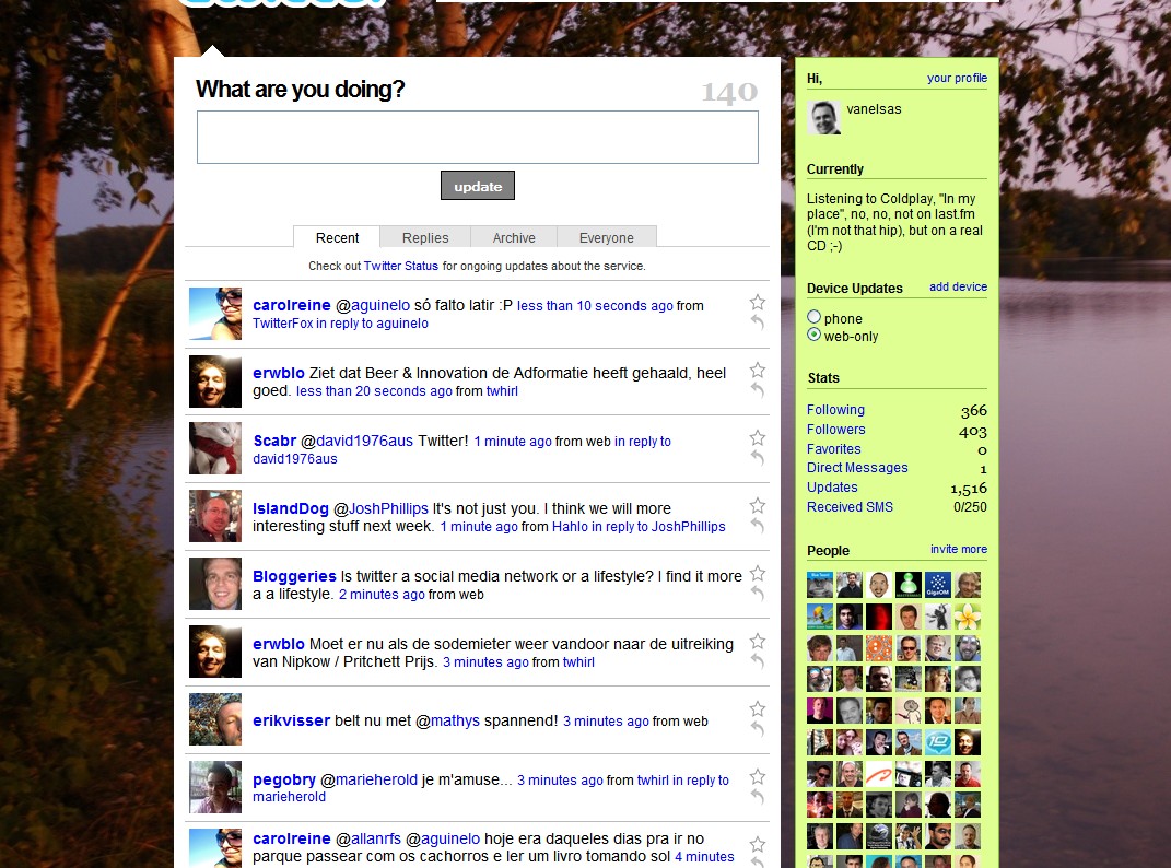
Twitter is one of the communication services I use on a regular basis. While I have tried several Twitter clients, one flashier then the other, I’m still reasonable fond of the Twitter home page. Why? Because it is deprived of too much functionality. The basic features, Tweeting and looking at tweets are presented in a simple and elegant way. The profile images make sure tweets are personalized because I can recognize images faster than names. The content is presented in a tidy way, and maybe most important of all, Twitter enforces the rule of only 140 characters, a brilliant move to keep things simple and concise. I don’t mind at all that I have to hit the refresh button of the browser (unlike with the different twitter clients). I also don’t mind missing tweets pass by as I forget to refresh. Most Twitter clients decrease in usability really fast because they minimize the space they occupy (Twhirl is a great example of this, it looks cool, but it’s UI isn’t nearly as good as the default Twitter home page). Instead of making the service convenient when using such small client, it actually gets in the way of usability and readability for me.
Not everything is great about Twitter’s home page. I don’t like the method of adding new people to follow. And I don’t like the fact that pressing options or links make me go somewhere else. I’d rather stay where I am and do the thing I wanted to do there. Going somewhere makes me mentally leave the service, and that’s not right.
Minggl

This service has gotten a lot of great press from A-list bloggers. Minggl integrates a number of social networks into your browser. It sounds like real handy, but I am afraid I don’t like the UI very much. There is a lot of cluttering when all my friends are displayed on the sidebar. There are many buttons in the toolbar that are not clear on sight what they do. There is actually only one button that could have made sense (it is the Minggl button) all the way on the left). But instead of turning the toolbar on and of as I expected, it merely sends me to the home page of Minggl, a place where there is nothing to do for me.
To me the Minggl UI in its current form provides no value, making it a service that sounds next-gen, but will probably not attract me enough to try it out. This is a struggle for any social networking service. Most users have more friends than can be displayed in one overview. As a result a compromise is sought to provide the user with a better view of his friends. But it proves to be very difficult to get that right. In most cases the solution would probably be to buy a flat screen of 2×3 meters, but since not every user has one of those, designers tend to scale down, instead of limit.
Wixi

I have written about this service before. I tried it as a Beta user, only to never return to it. The UI was non-appealing to me. Interestingly enough the home page which I revisited just now seemed to indicate they had improved the UI, but when I logged in, nothing much has changed. It isn’t a difficult interface, but for some reason it is non-inviting for me. I find the folder icons floating around a bit loose from the rest. As if they don’t belong to the service. An example of a new service with a UI that for some reason gave me no reason to actually try it out. That may not be fair, but it is the truth.
Flock

What can I say. Flock is a web browser that has it all. But not for me. I find the UI incomprehensible. I don’t like it that they have chosen different icons for pretty standard functions, the icons aren’t self explanatory to me, but most of all, it is just too much. Be honest, without reading a manual or hoovering with your mouse over any of the icons shown on the left. How many of them can you assign an action to? There are at least 10-15 icons displayed there that I don”t have a clue what they do.
The main screen isn’t much better. I can’t believe how much information is screaming for my attention on this one screen. My brain melts down if I remotely try to grasp what is displayed there. Flock may be a browser that integrates social networks for me, but it suffers not just from a cluttered UI, but from a cluttered concept.

In my personal opinion Flock is a good example where the UI defines the identity of the service (or the other way around). I have great respect for Chris Messina (I believe he is one of the original designers of Flock). But I find that too much functionality in one concept makes the overall service and its usability far too complex, and therefore hard to use for me.
Friendfeed

I’m pretty impressed with the design of Friendfeed. It’s a pretty complex service with an incredible amount of information (if you start subscribing to a lot of users). They try to keep the screen from getting cluttered by using a simple and elegant design. They try to reduce the amount of information (text), it is pretty obvious where the comments and the likes are. The channels are depicted with icons so that you can guess where the info came from. There are tabs at the top that allow you to see other views. I’m not so fond of the extra options a user has when he looks at an entry. He has the option to like, comment, hide , or more. Especially the hide and more links are a bit confusing to use sometimes. Below the more link are a bit technical terms such as “link to this entry” and “reshare”. Not sure what they do, unless you try it out. Friendfeed will have a lot of UI challenges coming to them. The users are already crying out for filtering or ranking algorithms (hey, they are early adopters right). Extra functionality leads to possible UI difficulties. It will be interesting to see how the team can resolve that.
In conclusion
Getting the UI right for a product or service is a nearly impossible task. There are so many factors to take into account. It is often the place where a service suffers most when implemented. At the same time there are examples where the users in general find a UI well implemented. Most likely because the designer (or team) has not thrown their design rules out of the window when the development takes place. I’m not pretending to be an expert on the matter in any way.
But I’m a user. And these UI’s are designed for me, and all other users. That gives me the right to have an opinion on them. And that is what it is, nothing more, nothing less, it’s my opinion. And while I’m probably not easily satisfied, I have the deepest respect for the UI designers in this world. It is one of the toughest jobs there is. And it takes the best of them for a service to have a chance of being successful.
Never, ever, compromise on UI design. You don’t have to get it right from the start, but you have to have a clear vision where it is supposed to be going to. You have to have a set of design principles that you carve in rock and don’t easily step away from. In my opinion the UI is one of the most important fail factors for any new product or service.
I’m interested in hearing your opinion on this. What UI do you find really great or really awful?


Oh sure post this at almost 4AM 🙂 flagged to come back to in the morning as you are touching on a subject near and dear to my heart …….
Look, everyone knows driving a car is Impossible! Try switching gears, looking at all those mirrors, having all that weird stuff on your panel, all those pedals and windows around you have to look all the time – and at the same time!
That’s nuts. There’s no tactile feedback!
And just take a look at my horse – it Feels me. I can barely move my legs and it will turn right or left. I don’t need to take care of any of those small interface things like pedals or rear view mirrors or that strange wheel.
Horse power!
And while I totally agree with most of the following on services and UI’s – you have to admit that it is always not about just trying to give users best/clear/usable UI – but it’s always about finding the best balance for the particular project.
Some project has to have 1% of design to be successful (craigslist?), another goes high with his tons and tons of UI work pushed inside (yelp?).
It’s not that simple. Not just “work on your UI like crazy”. It’s about finding the best proportion for your particular task.
@Vlad I ride horse too, know exactly what you mean 😉
I assume you don’t mind not having tactile feedback on the iPhone. The reason I need it is because I use all my GSM devices 90% for calling and SMS. And I use it when I move around. In those situations the iPhone jsut doesn’t work for me. I have to make a full stop and get sucked into the device. It is a much better immobile handheld device.
I am not sure how to respond to your example of craigslist. It could be argued that although the UI is crap, it still provides enough value. But maybe the UI is perfect for the thing craigslist provides.
In general I would say that the UI is important enough to pay a fair amount of attention too. I am not sure it means “work on your UI like crazy”. But it does mean that if you haven’t thought it through well enough you will lose users that want to give it a shot. In my personal case, if the UI doesn’t help me fast enough, I tend to give up. There are almost always alternatives available. In some cases, I find the service so valuable, I’m willing to put up with an interface I don’t get, or at least invest more time to comprehend it. But in most cases, I don’t honestly.
Great post and I agree on all counts – UI can turn me off on a product almost immediately, which is why I continue to be a big fan of Google. Nice and clean.
There’s also another part that ties into the UI – speed. If I have to wait 15+ seconds on a speedy broadband connection for a page to load, I won’t use it. A good example of this is Digg.com. Though they’ve taken great pains to tweak things, it nearly locks up my browser when trying to load an article.
This can be related to other factors, but often it’s related to a poorly designed UI that needs to load too much information.
@Vince agreed, speed can be a huge interaction issue. Often it’s back end, but it is also related to a flawed interaction design too 😉
I can definitely agree with your thoughts Alex.
I won’t even bother to use a service if it’s fugly design/UI wise. Features and functionality come second, but if I have to look at a hideous and unintuitive layout all day, I don’t care what it does, I’m not using it.
While I am a fan of clean UI design and I do love the Twitter interface, I have to disagree with you on Flock. I’m very fond of their interface, because though there are a alot of icons when I actually use them it speeds up my web-browsing speed, letting me accomplish more in less time. I’ve added to it by sticking in google toolbar and stumbleupon toolbar too. If I’m going to have a bunch of icons I might as well go all out 🙂
Pingback: WinExtra » Happy early adopters don’t equal success
Completely agree with you. My specific niche and expertise in website design is usability and accessibility. Usability is the primary factor as to whether a new service is going to succeed or fail.
In web terms usability is navigation and the ease of being able to do what you want. It’s no surprise or coincidence that some of the most successful services have the barest and most functional interfaces.
Just look at Google, basically. That’s the simplest interface on the internet. It’s got the most natural navigation. And it’s the most successful.
I am very happy to see that there are more and more services out there that are similar. Some times some services will not fit the fancy of everyone. Sometimes we have to be patient with others until the ones that are working on these services get the bugs out or get a larger server. There is one thing for certain, socialization is here to stay online. In fact, it is growing ever so fast.
I have stated this before, and I will do it again, I think SecondLife has a giant future, if they can work out their issues. Once they do, I think more jobs in real life will be done on SecondLife. Du to many factors, conventional jobs are slowing down. It will be the Internet in the 21st Century that will carry the torch to wonder beyond anyone could ever imagine.
I agree, UI is very important but it’s just a part of a bigger picture called user experience. You need to focus on experience first and everything else will fall in place in requisite proportions.
Check out some of my posts that highlight the need to focus on “overall” user experience and not just a part of it
Pingback: Prototype of a Person » Blog Archive » Cyberpsychology Digest Volume 3
Pingback: WinExtra - From the Pipeline – 6.6.08