
I am often curious about new products and services. Particularly interested in the intuitiveness of the user interface and the way the product or service presents its functionalities to me. Just a few of the products and services I tried in the past year or so are my Samsung D600, Nokia N95, WordPress, Skype, Twitter, Jaiku, Orkut, Facebook, CuBase (music software), VodPod, Apple TV, Joost, Gaia, many different Firefox plugins, Flickr, Wixi, Shozu, Twitbin, and most recent Flock (there are many more but that is a different story).
I find that many of the products and services lack good user interfaces, are cluttered with functionalities that I find hard to understand to use, that monetizing schemes are in conflict with my preferences of usage of a service, and that often the service in the end doesn’t really provide me with real value (but that is another topic I could write about).
Developing an intuitive UI is really difficult. Many startups seem to focus on functionality instead of UI. It is more important to have many cool features than to have few features that actually work in an intuitive way for a user. I find myself struggling with most of these services, which usually ends up in not using them. Now I may just be much less of a tech person than I thought I was (see my struggle with getting pictures taken with my mobile onto the Internet here), but I always have a simple 2 pass test that a service goes through. Only if it passes both steps, I would categorise it as being intuitive or even useful.
First of all, I try to use the service as your average Internet user. No manual reading, no assumptions on how things work, a clear mind and just work the thing (hé, I am a guy right!). If I can’t grasp the concept quick enough of find that the UI provides too much cluttering, functionalities I don’t get, or unnecessary steps I usually give up. Just a small example. It takes me almost twice as many button presses to send an SMS from a Samsung phone compared to a Nokia phone. I can’t believe that such a crucial and yet simple functionality (SMS) is being obscured by such a lousy interface. Or another one, notice that web 2.0 services tend to mask complex functionalities behind very small and often not intuitive icons (a few examples further below).
Second, if the service has passed my own observations in a positive way I increase the stakes and play my most evil trick. I ask my wife to give the service a go. Now my wife is the same age I am, 38. She is not a tech person, she is not into the latest Internet trends, but she does use Internet, e-mail, IM, her mobile phone, SMS, MMS, and even Mobile Internet occasionally. She usually nails the service for not providing anything useful (try explaining her why Twitter enriches her life, yeah right!) , but if she does try it, I can often see her struggle with operating the service because the interface was clearly not designed for a user like her. Only few services really pass both these tests.
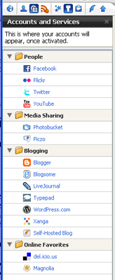
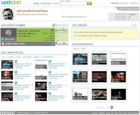
In terms of mass adoption I always tend to think that a new service that is not intuitive to my wife (or people alike) will have a hard time to obtain millions of satisfied users. I do realise that a younger generation is in many ways more experienced, but in the end the same thing holds for them. If the user interface sucks, it will turn people off (you first need a compelling service of course!). They might adopt at first, but they will leave the service as soon as something cooler comes along. I have some examples of interfaces I looked at here. Please note that I don’t want to suggest that the examples are no good, but they do draw my attention in different ways:


That is why I’m so often skeptical about positive reviews of new services in the blogosphere. The people writing them are not your typical or average Joe. No, they are the tech creme de la creme. Bloggers tend to have a view of what is useful or creates value to a user that is totally disconnected from the mass that should adopt it. Bloggers are often technically more able (wow my N95 does WiFi) making them like features that no one else in their right mind would care about.
The same thing seems to hold for investors too. While they tend to focus on scalability and monetizing models, they seem less interested in services that actually provide value to its user in an intuitive and simple way.
But the real issue lies within the startups that create all these new services. Under the new “Internet Mantra” called “Let’s develop with our user community” they often seem to launch Beta services with only one objective:
Be the first to do something new, get attention from one of the bigger media companies, and sell and become rich and famous. Actually that is 5 goals now I come to think of it.
And look at the way they all copy each others styles, producing the same lousy UI designs in the end. Another small example, have you ever browsed the web 2.0 directory here? Notice how many logo’s are the same style, sometimes even copying color styles, form, anything really, of their competitors? If web 2.0 has brought us anything it is the copying of designs that have been done already (yawn).

But as a service provider you only get one chance at making a good impression. And UI design is so often lowest priority for Beta launches, even though the impact on the service’s success can be huge. Don’t get me wrong. I am a big fan of community development. And you don’t have to get it all right at once, but you may want to put a little more effort in it before you come and harass me with it.
To all those startups that have great ideas I would say: guys, impress me with usability before you ask me to work with the service or even consider helping redesign your crappy UI for you!
How about you? What UI designs do you like? Are there any products, services or startups that did get it right?


I’m in Japan so haven’t been able to use their service, but Shozu sounds like they have a pretty transparent UI, from what I read about it. But I think this is given that the user knows how to use the camera function on his mobile phone. I work in the mobile UI field, but camera functions are very confusing on all the phones I’ve had!
Hi Nyom, is there a reason why Shozu doesn’t work in Japan? I agree thqat camera functions are often confusing on camera’s. What I do like about Shozu is that, after corret installement (which is not easy, see my earlier post on that), ShoZu pops up a very simple menu after you take your picture. It simply asks if you want to send it to the destination you set up (in my case Flickr). If you press on that option, you can immediately go backto taking pictures, and ShoZu transports your picture to flickr in the background. Works very simple and effective.
I love this site.
Nice design and content!
Keep up the good work!
Thanks
Bryan
Great article.
I was recently hired to redesign a web app that I eventually realized will not make it (it is not released yet). Don’t get me wrong… I am very proud of the design and UX work I did… but it was hard to explain to my client that all these unnecessary features will only make the user want to leave.
Nobody is looking for an app that will give them more ways to do something they are already doing in one familiar and very easy way.
It sucks but people must realize cool effects are not cool if they make things slower or less efficient. Web app design is not about dazzle and decoration. It is about simplifying the process of getting a task done and creating a smooth, pleasant experience.
But… well, I guess it will take some time (and a few blogs like yours) to make people understand this.
@Ilina you are absolutely right. We often tend to let our ideas and creativity lead us to come up with more “cool” features than necessary. Not only does it scare off users, but it also increases development costs and inhibits good beta testing in the market, with real customers. Keeping things simple remains the best advise
very interesting, but I don’t agree with you
Idetrorce
@Idetrorce It would be helpful if you explained a bit what it is you do not agree with 😉
Stop whining about the way GUI looks like. Most GUI’s is designed for people who use the product on a daily basis FOR REAL WORLD WORK.
Take the music editor for example. Only a person who works with music will really care about all those settings or even know what they are for.
The same is said for Camera’s, fancy celluar phones, graphic editors, editors in general, websites, display panels, or whatever.
I suggest picking up a PSP if your looking for a GUI
that even an illiterate person could understand.